|
For this assignment I was required to code an entire website that shows who I am. When I first received this assignment I was very intimidated as I had just move 8 hours from home and was still unsure of who I was. As I began thinking about how I wanted my website to look I tried to think about fonts and elements that would best describe who I am and what I am passionate about.
To build my website, I used a very basic templet to give me a layout that wasn't as intimidating as a blank page. I then began adding in photos, changing fonts, and adding a color scheme. Getting my website to look how I wanted through HTML was not the difficult part. For me, trying to figure out how to get the CSS and HTML pages to link up and be able to code each element correctly so that I could design the pages the way I wanted was the most difficult part of this project. After asking many questions and looking at tutorials through w3schools, I was able to be more successful than I ever could have imagined. My vision for this website had originally been this very elaborate and detailed thing that was going to be full of animations, slide shows, fonts, and colors that would really represent me. I then came to the realization that I had to actually create this and my vision changed drastically. I began thinking in terms of "less is more" and found that while my site may not be the most high-tech or detailed thing, it gets my purpose crossed and shows who I am. The modes I used for my website mainly consist of visual and gestural modes. Visually, I tried to create a site that was pleasing to the eye through my color choices, easy to read fonts, and layout. I chose the color pink because it is currently one of my favorite colors and is just bright enough to catch the readers attention without being too overbearing. I chose to make my header this very pretty cursive font that was more intricate but still fairly easy to read and then for the rest of the website I chose more basic very easy to read fonts that would allow anyone to read the website. Layout wise I went with a simple template that would make my website interesting, but still visually pleasing. Gesturally, I tried to choose pictures that show who I am as a person. I chose pictures of me laughing with my family, sister, and then added in a few pictures of me in my hometown. For my design strategies, my purpose was to effectively demonstrate who I am and allow people to get a sneak peak of my personality. For contrast I tried to choose colors that complemented each other and pictures that portrayed what I was trying to say about myself. Color wise I went with the same color scheme so that it would get too overbearing or distracting for the audience to read. Overall, I am very surprised and proud of how my website turned out.
0 Comments
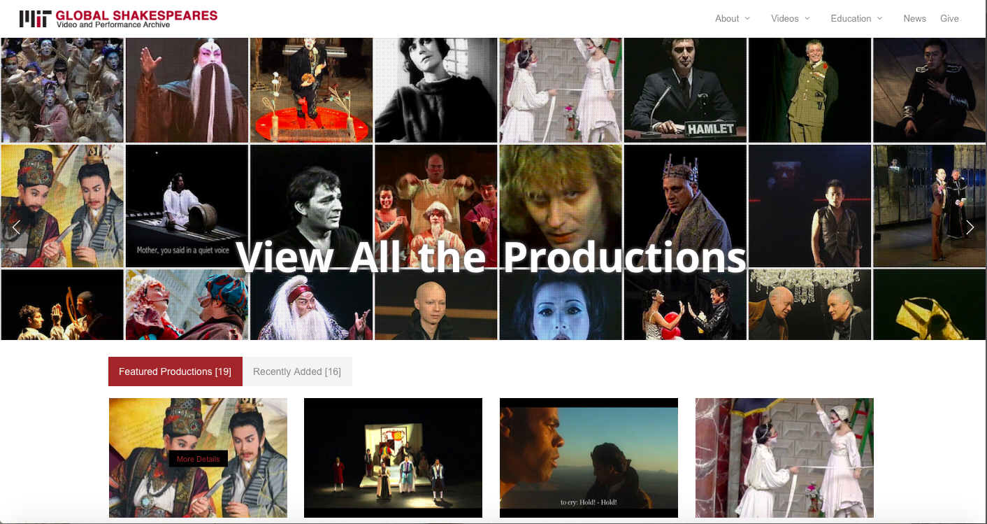 When looking at the design features and rhetorical choices made by the archives designers at Massachusetts Institute of Technology, they did a very nice job of making an effective website. Their homepage displays a grid of photographs from plays that are being archived in the website. They also have links to the direct pages of the different plays they have archived making the website very easy to manage. Located in the top right corner is a display bar that makes finding the information and videos to the plays very accessible. It gives off a great first impression to the reader that the website designers know what they're doing and that is shown in the layout of the website. The content of the homepage is really just trying to draw the reader in to website and then gives the reader a chance to explore the different videos, photos, and plays displayed in archive. The design is absolutely remarkable and I think that there a bunch of properties from this website that we should include in ours such as the banner that displays different photos and videos, the layout of the website itself, and the appealing color scheme that the website has. The white background and bold titles make the website easy to read, as does the black text that is used to provide content to each web page. The simplicity of the design makes the website very appealing to the reader while the different photos, videos, and layout keeps them interested in what the website is trying to convey. The size of the text is the perfect size and the font makes it easy to read. I think that when creating our own website we should incorporate the simplicity of this one and keep the color scheme similar in the sense that it is mostly black and white with a few pops of color that connect the text with the photos. I also think that we should incorporate photos and videos into the website to add more content and context to the website. The other pages that are located on the website are just as effective with their information by maintaining the simplicity and design theme that the homepage has. They're easily accessible and I understand the appeal to the website as I throughly enjoyed looking through it.
|
AuthorWrite something about yourself. No need to be fancy, just an overview. Archives
October 2018
Categories |
 RSS Feed
