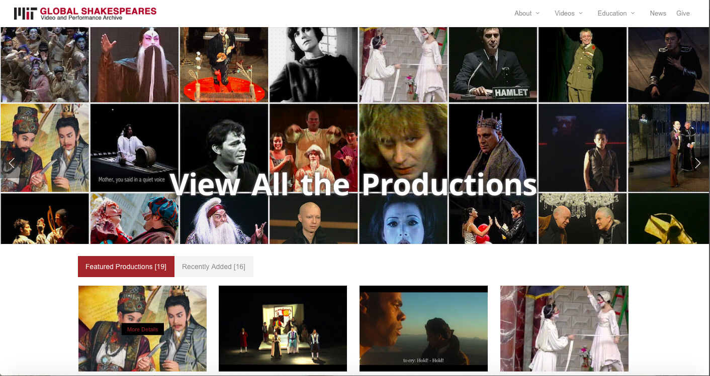
 When looking at the design features and rhetorical choices made by the archives designers at Massachusetts Institute of Technology, they did a very nice job of making an effective website. Their homepage displays a grid of photographs from plays that are being archived in the website. They also have links to the direct pages of the different plays they have archived making the website very easy to manage. Located in the top right corner is a display bar that makes finding the information and videos to the plays very accessible. It gives off a great first impression to the reader that the website designers know what they're doing and that is shown in the layout of the website. The content of the homepage is really just trying to draw the reader in to website and then gives the reader a chance to explore the different videos, photos, and plays displayed in archive. The design is absolutely remarkable and I think that there a bunch of properties from this website that we should include in ours such as the banner that displays different photos and videos, the layout of the website itself, and the appealing color scheme that the website has. The white background and bold titles make the website easy to read, as does the black text that is used to provide content to each web page. The simplicity of the design makes the website very appealing to the reader while the different photos, videos, and layout keeps them interested in what the website is trying to convey. The size of the text is the perfect size and the font makes it easy to read. I think that when creating our own website we should incorporate the simplicity of this one and keep the color scheme similar in the sense that it is mostly black and white with a few pops of color that connect the text with the photos. I also think that we should incorporate photos and videos into the website to add more content and context to the website. The other pages that are located on the website are just as effective with their information by maintaining the simplicity and design theme that the homepage has. They're easily accessible and I understand the appeal to the website as I throughly enjoyed looking through it.
1 Comment
Ashley Harris
9/18/2018 05:01:55 pm
I completely agree about your suggestions for the Nashville archive site! I think we should incorporate more visuals and a color scheme. I love your observations about the simplicity and ease of navigating this particular site. Good job! Leave a Reply. |
AuthorWrite something about yourself. No need to be fancy, just an overview. Archives
October 2018
Categories |
 RSS Feed
