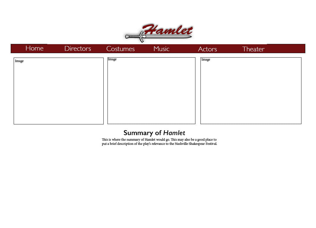
 For the Shakespeare website mock-up and logo I wanted to create something that was simple and visually pleasing to whatever audience happened to stumble upon the page. For the logo I wanted to place an emphasis on the play that we are covering in the archive which is why "Hamlet" is in bold, red letters across the top of the sword. I used a sword in the logo because I felt like the fight scene in the play was an important scene and I wanted to show the importance of that. For proximity I wanted the word across the top to line up with the blade of the sword because I thought that would create the most visually pleasing outcome. I also wanted the logo to be in the top center of the website because I wanted it to stand out while not being the main focus of the page. I chose the color red for the logo and the website bar because I wanted to emphasize the blood shed in the play and I also feel like red is generally associated with death. I want the summary and main points of each page to be lined up with logo in the center of the page because I feel like that is where the eye is most drawn to and I thought it would make the website easier to read/understand. As for the images along the top, I wanted each page to have images that related to the content each page, however, for the home page I would like to have a slideshow/interactive piece to portray the pieces of the play. This could have just general images of the play or could give "sneak peeks" as to what each topic covered is going to be about. Lastly, for the buttons along the top I wanted them to be bold yet simple, so I chose a thin font that was simple and made it white so that it would stand out against the red background.
0 Comments
Leave a Reply. |
AuthorWrite something about yourself. No need to be fancy, just an overview. Archives
October 2018
Categories |
 RSS Feed
